
This blog was written by SeatSync co-founder Mark Lenz, and originally posted on the SeatSync blog. You can read the full article here.
Over the last few months, everyone at SeatSync worked hard to bring the best ticket exchange experience to iOS. We wanted to share a little about how we went from an idea to an iOS app in the Apple App Store and hope it satisfies some of your curiosity.
Before I got on board to work on the iOS version, Graham, John and Mike already had the idea for SeatSync and a proof-of-concept server and Android app built by Mike. So, we had a list of features that formed the basis for the iOS app: find tickets by location, post tickets with a location, a request and exchange process utilizing push notifications, and chat. The most important goal that governed nearly every decision in the design of both apps was to make the ticket exchange experience as quick, simple and enjoyable as possible (with our available time and money, of course).
We had several long meetings and conversations to work out which devices and iOS versions to support. While we wanted to support every device, that can require significantly more effort than targeting just recent devices. We decided it wasn't practical to support iOS versions lower than 5.0, which excluded the original iPhone and the iPhone 3G. However, by doing so, we were able to more easily support newer devices like the iPhone 5 and implement enhancements like custom user interface elements. The trade-off seemed worthwhile as the already small number of active devices we wouldn't support will continue to diminish as the number of active devices we would support continue to increase. This also fits with our goal of providing the best ticket exchange experience possible.
Feature Selection
There were several features that we knew we wanted in version 1.0, and we also had a huge list of desired features and enhancements without enough time to complete them all. Deciding which features to implement is always a tough and complicated decision. We followed an ethos for triaging features and enhancements that I've found helps, particularly when faced with a deadline, to create software that users enjoy. It's a user-centric methodology that fits with our primary goal of providing the best ticket exchange experience possible.
At the beginning, features that took a large portion of the available time were removed from the list, and then the list was prioritized by which features we felt enhanced the user experience the most. Throughout development, I worked from the top of the list like a clerk checks out customers in line at Walmart. When we got close to our deadline, the list was re-prioritized so features with the most impact on user experience that also required the least amount of effort were at the top. This allowed me to implement most of the features that we wanted while pushing back features that would have left little time for other features or had little impact on the user experience.
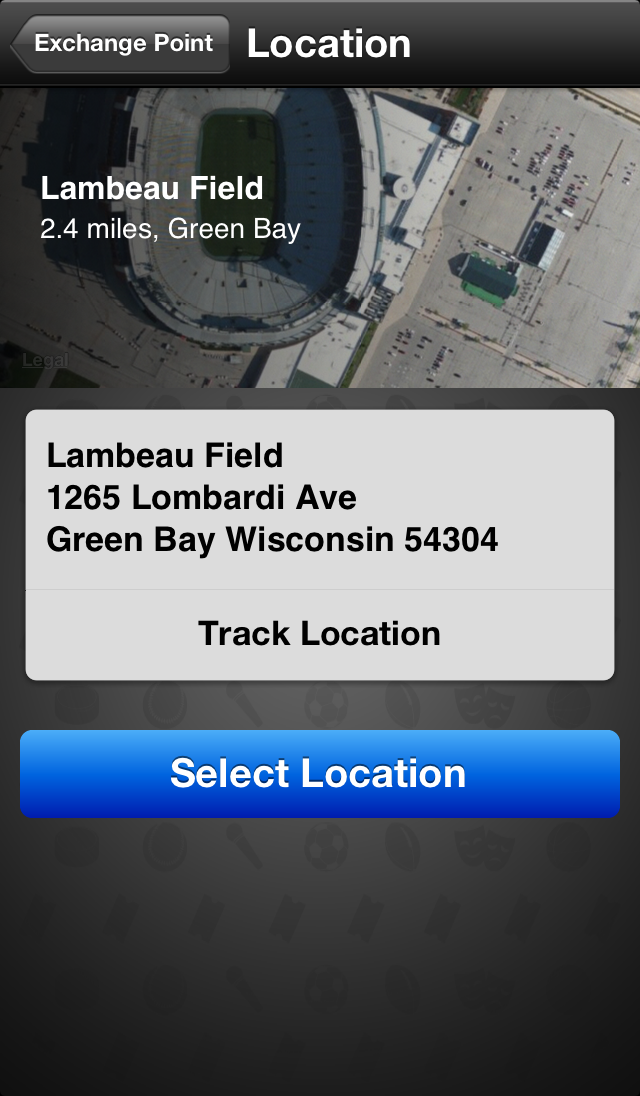
The Location view (shown above) was a much needed feature that was added near the end of development through this process. Before its addition, the app didn't provide a way to confirm the entire address, just the first line. For most cases, that's not a problem, but when the first line is something like "UW-Madison," one may need to confirm the address and not just the location on the map. If we had spent time on a more superficial feature instead, we would have rushed to add it at the end or in the next version, and it may not have looked quite as nice.
User Interface Design
When it came to user interface decisions, we wanted each app to be "designed for the ecosystem for which they live." That is, SeatSync for Android should look and work like an Android app, and SeatSync for iOS should look and work like an iOS app. This way, we weren't creating a brand-specific UI that everyone would have to get used to, or trying to fit UI from one platform into another. We wanted the apps to look similar and have the same functionality, but we tended to follow where the platforms lead.
For iOS, I strictly adhered to Apple's iOS Human User Interface Guidelines, in part because many are common sense guidelines for creating usable software. It's probably a good idea to follow Apple's guidelines for user interfaces when developing iOS apps, if only for fear of rejection.
From there, I had some rules of my own (with some overlap with Apple's):
- Everything should be easy to see and read with text and graphics that don't make you squint.
- Things that require attention, such as accepting an offer and rating an exchange, should "pop out" from the rest of the app.
- Buttons need to be easy to see, distinguish and tap, and their action must be easy to determine before tapping.
- Every action should have a visual cue, so users don't have to play around to discover features.
- Text and workflows should be clear and intuitive.
- Use all available data to provide useful and "friendly" information, and don't bother the user for information that can be determined from their actions or a data source.
- Everything should take as few taps while still being clear.
When designing the user interface for each feature, such as selecting an event category or posting a ticket, I first thought through the process in every way possible way (e.g., only interested in the Chicago Bears, selling multiple tickets for multiple teams at one time such as a season ticket holder for the Bears and Cubs, etc.), trying to put myself in the shoes of every type of user like a method actor "becomes" his role. Then I would brainstorm various user interfaces, often jotting down notes, and finally begin to sketch a workflow. After one or more sketches, if you can call them that, I'd set out to write the code.
Once the app was nearly complete, our graphic designer, Ryan Sneddon, stepped in to help give the app some needed polish. He took my "airy" descriptions of what I wanted and turned them into the eye-catching graphics throughout the app. The background seen on most views is the brainchild of Ryan, which was great, because the previous background was nothing to write home about. Ryan and I worked back and forth, sharing ideas on graphics, colors, positions and sizes until we were satisfied with the entire look of the app.
Check out the rest of Mark's post at the SeatSync blog!


