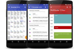
What passes for mobile application design in the Chicago Start-Up scene is somewhat criminal. An example picture as the cover image of this article is an android calendar application from the top designer in Chicago with obvious visual errors in application material design in an android application.
Here is why this is so important. As a start-up you only get one chance with mobile users and it is becoming increasing obvious that a start-up to in order grab an audience and traction should conquer the android mobile platform first(android users get to use Sdcards to install apps on 5.x and up and its an upcoming trend of new android device user to install as many apps as hey want..often 10s of apps).
Two, the number one set of applications by download numbers on the iOS platform is not by Apple but by Google and thus Google seems to have gained a mobile application visual design expertise that seems to matter among mobile users on both the iOS and android platforms.
It is now almost 2 years out since Google introduced Material Design for both mobile web design and mobile native applications. Yet the brand-name designers in Chicago that design mobile android apps for start-ups have yet to apply material design visual concepts to any of their applications and the startup applications of their clients.
That visual design difference between erroneously applying complimentary color matching instead of the recommended vibrant monochromatic or analogous color matching is the difference between a so-so start-up application and an android start-up application that gets high marks from its users. Chicago in both terms of VC money and start-ups only has less than 1/2 of a percent of the money and start-ups in the USA. The way you step outside of that low percentage box is by visually engaging the android user audience.
But no, we instead have project managers, designers, etc insisting that Google Material Design is a fad and should be ignored because with non mobile devices complimentary color matching worked so it should with mobile devices too. But, with your start-up's future on-the-line can you ignore it from the number one app publisher on the iOS platform and the new visual design system they came up with for mobile web and native mobile applications?
Rise up out of the Chicago Mobile Start-Up Ghetto and reach your start-ups potential with material design vibrant monochromatic and or analogous color matching. This is obvious a simplification as material design also includes typography which is why the material design color suggested palette lines up with the weight designations of fonts. And it might even be time to totally wipe out that iOS/Apple bias in developing your start-up's android application by getting someone who cares about material design and the android platform to design and develop your start-up's android application.


