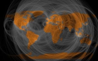
Eric Fischer. Map of the frequency with which people in different places @reply to each other on Twitter.
According to IBM, 2.5 quintillion bytes of data is created everyday. Astonishingly, 90% of the data in the world today has been created in only the last two years out of the roughly 6,000 years we have existed as civilized beings.
All of this data we are creating everyday comes from everywhere. Embarrassing picture posts to Facebook by your mom (or most recently Instagram, despite your best efforts to shadow it from her sight). Silly drive-thru Vine videos your teenage cousin is creating which you quite frankly do not understand. Registers at Starbucks for your much needed grande pumpkin spice latte (it’s Fall). Sensors in cities monitoring traffic patterns. These are just a few examples and in no way will data collect points lessen, if anything, they will continue to grow in our public spaces and in our homes. Particularly with the immense growth we are seeing within the IoT space.
Now some data sets are clearly more value than others (I am not sure what immense value is held in my 4th grade class picture) but it is clear that no data set is of value without order to make sense of it all. This is where data visualization steps in. In a later post I will jump into some of my favorite data visualization tools but for now, enjoy exploring these 3 amazing data visualization projects below.

GNIP is Twitter’s enterprise API platform that enables businesses to visually make sense of Twitter’s massive social data trove. In partnership with MapBox, they publicly released this super cool geographic usage pattern map of more than 280 million tweets.
Background on the data used to create the map is rather light but nonetheless this is a super cool, interactive, map to play with.

This map was created by Dustin Cable while at the Weldon Cooper Center for Public Service at the University of Virginia. It serves as a snapshot of the US population based on the 2010 Census and displays 308, 745, 538 dots, one dot for each person living in the US during the 2010 Census and color-coded by race.

This map is a bit interactive and displays wind conditions within the US, current wind speeds and direction are updated on an hourly basis from the National Digital Forecast Database.


