By Jack Palmer, Analytics Manager
- Image courtesy https://random-blather.com/
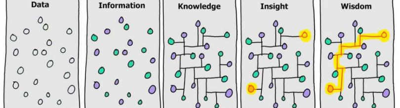
The image above is a great way to think about presenting data visually. At its core, data is a collection of random information, without innate meaning. The aim of good data visualization is to take it from raw data, provide context, and deliver actionable insight. But how do we utilize data presentation to take data and turn it into insight? Here are 7 tips to help guide you to present data effectively.
Before You Start
The first panel of the illustration should really be labeled “Clean Data”. Before you think about presenting your data, make sure to validate it.
-
Choose the Right Visualization
The first step in presenting your data is choosing the right visualization. First, ask yourself if a chart is the best way of visualizing your data, or whether the data is best conveyed in a table format. A table is particularly useful for high-level data, especially when comparing multiple variables. If a chart is better suited to the task, this flow chart is a great tool for guiding you to the right visualization for the message you are trying to convey. If you choose a particular visualization and then you are struggling to get it to convey the meaning you want, then it is probably not the right fit. Start over and re-examine how you want to present data.
-
Use Color
Looking at the image at the start of this post, we see that the first step in translating data to information is adding color. Color is key for allowing users to quickly interpret a visualization. The first thing that you should ask though, is what value does color add to the chart? Will it serve this purpose effectively? Color can also be combined with shading to allow certain values to stand out as a form of annotation. It is also important to keep in mind that colors carry inferred meaning. For example, in a heat map, the values you want to present as “good” are more likely to be colored green, and the “bad” values are more likely to be red. To avoid cognitive dissonance, use neutral colors.
-
Remember: Less Is More
As the person familiar with the data, you may be tempted to try and convey as much information as possible. To you the data itself conveys meaning in itself as you have a deep understanding of it. A new user, however, needs to be guided towards the meaning and often doesn’t care about the entire picture, just the key element needed to focus on. With every data visualization or chart, ask yourself: is it immediately translatable to a new viewer, and is every component necessary? Focusing your visualizations allows their message to ring more clearly.
-
Label Your Plots and Charts
The painter Harvey Dunn said, “Any picture that needs a caption is a weak picture.” That’s true for art, but it’s definitely not true for data visualizations. A visualization should be as easy to read in itself, but there are a number of questions that most people immediately ask about a visualization. What is it showing? Where did that data come from? Titles and captions are key for this. Using a title (and potentially subtitle) is a good way to provide context to a visualization and guide the user to its meaning. A caption allows the user to understand the source of the data.
A good way to understand the power of good labelling is to review the visualizations on a site like FiveThirtyEight, which has a strong standard practice for presenting data.
-
Annotate Your Data (Carefully)
In addition to titles and captions, annotations serve as the signposts that point users attention to the message you want to show with the data. If we return to the illustration, this is the point at which we add insight. The key of good annotation is to do it sparingly; not all points should be labelled, just the ones that matter. Annotation also serves the function of observing the context within the whole. For example, if there is a sudden jump in web traffic on a given day, an annotation can be used to give context for why it happened.
-
Be Consistent
Sometimes it is tempting to treat each chart individually, but in a presentation the visuals are part of a whole. That means that if one color is used to indicate a particular variable on one chart, then ideally that color remains consistent throughout the presentation, even if your labelling is clear. If you can create a consistent style and color palette throughout your presentation, even better! Consistency also allows you to train your viewer to interpret a repeated visualization more quickly.
-
Share Your Data Ahead of Time
It might have been helpful to mention it earlier, but presenting data visually is hard! Particularly for complicated analyses and viewers unfamiliar with the data, it can be a real challenge to present data concisely and clearly and to convey a clear argument within a constrained time period. One approach to combating this is sharing your data ahead of presentation time. This works particularly well for in-depth studies. This allows the users to read through the document and take some time to understand the visualizations.
Bonus Point: Be Inspired!
Great data visualization can uncover a hidden insight or cast a question in a whole new light. It can also be beautiful, and it’s worthwhile to seek inspiration from the examples available online. Information is Beautiful and the Tableau Public gallery are two of my favorite places to start.
The 3Q Decision Sciences team helps clients leverage the right platforms and find the right metrics and KPIs in order to gain insights, use those insights to optimize their campaigns and user experiences, and get better results from their media campaigns and digital properties. If you’d like to learn more, contact us today!