In the past year, the Chicago tech scene has seen a number of pillar companies announce new names, logos and visions for the future. What motivates companies to set staple names like ContextMedia or VISANOW aside in favor of something new? We checked in with the leaders behind those companies, and several others, to find out.

Since its founding as ContextMedia in 2006, Outcome Health has significantly expanded both the scope of its mission and the range of technologies it uses to achieve it. When the fast-growing company announced its rebrand at the beginning of this year, its primary goal was to ensure that its name and logo reflected this broader vision.
Why did you decide to rebrand?
“When we founded the company as ContextMedia, our focus was to leverage media technology to educate patients with relevant health information in the moments before their consultation,” said president and co-founder Shradha Agarwal. “In the past few years, we continued to innovate on our platform, and soon our technology transcended the capabilities of traditional media. By deploying interactive technologies such as digital anatomy boards for physicians to use during consultation and interactive self assessments for patients in the exam room, we were moving beyond information to deliver measurable outcomes through actionable intelligence.“
How does the new brand reflect how your company sees itself?
“We wanted to find a name that reflected the sophistication of our platform, our aspirations for the future and, most importantly, the improved outcomes that we delivers to all the stakeholders that we serve,” Agarwal said. “It reflects our mission, which is to activate the best health outcome possible for every person in the world. The new brand is more than a name or a logo. It brings a clarity and alignment to our daily work, and empowers our team to work with speed, autonomy and focus to realize that mission.”
Did you consider other names or logos along the way?
“Over 600 names were suggested to us to select from, but Outcome Health was a name that came up a year ago at a leadership team offsite and truly resonated the most," said Agarwal. "The 'Nexus' icon — which was also the product of countless iterations — represents our role in bringing an entire industry together through our technology and shared goal of improving outcomes. The various colors of the nexus icon represent different stakeholders in the health ecosystem while also evoking optimism and vitality."

Founded as an enterprise IT consultancy in 2001, Solstice was originally called Solstice Consulting. In 2008, the year after Apple launched its first iPhone, founder and CEO J Schwan decided to make a successful pivot to become Solstice Mobile, despite deriving less than 5 percent of its revenue from mobile at the time. In September 2016, the company decided to drop the 'Mobile' moniker entirely, with a strikingly similar rationale.
Why did you decide to rebrand?
“Over the past seven years we’ve grown from a Chicago-based mobile boutique shop to a global innovation and emerging technology firm of over 400 designers and engineers spanning four cities in three continents,” said Schwan. “From displays, web and wearables, to voice, connected devices and robotics, we’re helping to prove what our clients are capable of through groundbreaking digital solutions.”
How does the new brand reflect how your company sees itself?
“We dropped ‘Mobile’ from our name to signify a much broader focus on emerging technologies, but we never debated dropping Solstice, which to us, represents the core of our culture and organization,” said Schwan. “We have a core set of beliefs such as servant leadership, defying gravity and making a difference (to name a few) that continue to inspire our efforts every day.”
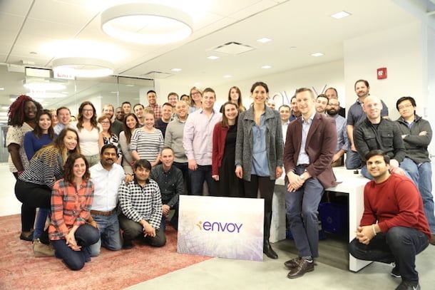
Founded in 1998 as VISANOW, Envoy’s original mission was to use technology to guide applicants through the complicated U.S. immigration system. But the complications of managing a global workforce don’t stop at the border. The company’s new brand, launched in December 2016, reflects the company’s new vision for global HR management.
Why did you decide to rebrand?
“As the HR industry and global talent marketplace have evolved, we consistently hear from our customers that they’re seeking an end-to-end global workforce management solution so that they can more efficiently hire, deploy and manage their talent across borders,” said president and CEO Dick Burke. “This rebranding effort combined with the recent release of the latest generation of our immigration management platform highlights our ability and commitment to serve as our customer’s envoy as they build and manage a world-ready workforce.”
How does the new brand reflect how your company sees itself?
“The rebrand is a reflection of how both our services and our employees have evolved as we continue to provide a holistic offering to help build a world-ready workforce,” said VP of human resources Lindsey Dagiantis. “[We] want to empower each employee with a clear understanding of how their efforts tie into our success, as well as how they can continue developing their own professional journey through frequent feedback sessions, training, recognition and support for each phase of their career. Our culture truly embraces that of being on a journey: you have to be passionately tied to our the mission, while also understanding the urgency around how we continue to innovate and drive results for our customers.”
Did you consider other names along the way?
“We knew the importance of a great name; especially after we had spent almost 20 years investing in our previous name. We also knew the evolution of our product, service and value we bring to our customers was significant enough to make a change,” said CMO Jamie Gilpin. “This is a subjective process and everyone has an opinion so we went through hundreds of names. When we thought we had one, trademark issues prevented us from moving forward. Envoy came in the very last round and every stakeholder felt this was ‘it’. Our mission is to make it easier for people to work anywhere in the world... It was exactly what we were searching for — and no trademark issues.”
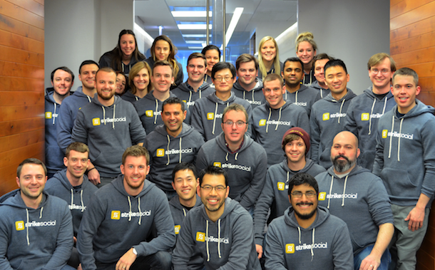
Sometimes, refreshing your brand is a better option than scrapping it altogether. That was the conclusion Strike Social came to in 2016 after moving to Chicago from Los Angeles. The company, which got its start in 2013, relaunched with a new website, an updated visual profile and solidified positioning in November 2016.
Why did you decide to update your brand?
“When Strike Social started out, our founders were working from a kitchen table,” said director of marketing Brendan Shea. “In those early days, they had to be scrappy with everything, including our visual identity. But as we grew to a global enterprise — now with 150 team members and 500 clients — we knew we needed to take our branding to the next level.”
How does the new brand reflect how your company sees itself?
“The refresh of Strike Social’s brand reflects a company that’s reaching new heights,” said Shea. “Our team is growing. Our revenues are climbing. And our tech is revolutionizing the ad industry. Since our people work so hard to make this possible, we wanted to put forward an equally polished brand — something that would inspire us even further.”
What has the process of refining the brand been like?
“While working to refresh Strike Social’s brand, we got a lot of input from our clients. In fact, we even sent out a survey,” said Shea. “The goal was to make sure any changes were in line with how our clients saw us and why they chose us in the first place. We also asked people which celebrity they thought best represented the Strike Social brand. Our favorite response was Neil deGrasse Tyson, which isn’t too far off since three of our data scientists have PhDs in particle physics.”

Frontline Education was founded in 1998 to aid educators, school administrators and support personnel in developing the next generation of learners. The company, which employs a sizable contingent of technologists in Chicago, rebranded from Frontline Technologies in August 2016 to reflect its specialization in the K-12 education space. The company also revamped its logo with a fresh shade of purple, to stand out from the tech landscape’s sea of blue.
Why did you decide to rebrand?
“Growth was a major impetus for our rebrand. Our former branding served us well as a single-product company with a very specific audience. However, as we grew in size, scope and solutions portfolio, it became apparent that we needed to solidify our space and purpose within the education community,” said chief marketing and strategy officer Tony Marzulli. “The rebrand was about more than just a facelift, it was a shift in how we represented ourselves visually as well as how we communicated what we do and who we serve. It redefined us as a visionary leader in education.”
How does the new brand reflect how your company sees itself?
“The new branding is a comprehensive representation of our approach to serving those who serve on the front line of education. The name Frontline Education reinforces our dedication to partnership with the education community,” said Marzulli. “The colors are refreshing and relatable in a way that speaks more to education than technology. The messaging is 100 percent focused on understanding the K-12 organizations we serve and providing them with actionable insights that inform their decision-making process. It is a truly holistic approach to brand management that takes our core values into account and reinforces them at every point of interaction.”
What has the rebrand process been like?
“Internal communication of our rebrand was a major consideration and our first concerted effort to communicate the vision and purpose of the branding initiative,” said Marzulli. “Having our employees understand the reasoning behind the rebrand so that they could support it and speak about it passionately was key to our transformation and ability to relay the messaging to our clients.”
Born out of a merger between Think5 and InnFlux, Cloud5 Communications combines data analytics, high-speed internet, telecommunications systems and services for the hospitality industry under one roof. Executive VP and chief commercial officer Mark Holzberg said the new brand was born out of the company’s growing emphasis on cloud-based solutions.
How did the decision to rebrand come about?
“We’re investing in our business to shape the future of hotel guest communications and experience,” said Holzberg. “The Cloud5 rebrand was a natural evolution for us because it signifies how we deliver on that experience through our comprehensive suite of cloud-based communications, converged networks and enhanced services for hotels.”
What does your new brand signify?
“The cloud is the core of our business as well as the direction of networking and data communications overall,” said Holzberg. “If businesses are not looking to leverage the power and the efficiency of the cloud, well — they’re going to be left behind.”
Images via participating companies.
Got news about a cool new startup? Let us know with a tip or a tweet @BuiltInChicago